|
Statistics
Total online: 1 Guests: 1 Users: 0
|
Trade
The types of market graphs
For convenience of perception of the market situation in the trading terminals, through which work traders use different types of market charts. They give us the same information for the same amount of time, and therefore, it is impossible to distinguish objectively the best option. The difference between them lies only in the way of presenting information to the trader.
In other words, only graphical representation of the data exchange is different. Each currency speculator can choose the most convenient for your own option trading. Below we consider three types of market schedules for use in Meta Trader 4.
Types of Forex charts
Market chartsthat can be seen in the terminal, are of the following types:
1. Line graph
2. Bar Graph
3. Japanese candlesticks
We denote the main features of the three types of mapping according to prices from time to time. Each option is valid, the traders at their discretion stop the choice on one of the graphs.
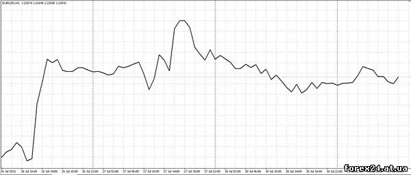
Line graph
A line graph is a curved line drawn through points formed by the closing prices of the trader selected time intervals. For example, if a speculator opened a price chart of EUR/USD at TF = 15 min, then every 15 minutes appear to be the point of the price, which was the last fifteen minutes.
Points equidistant from each other horizontally, as does a fixed period of time to determine each new point, but to varying degrees removed from each other vertically. There is a curve line that runs consistently at all points, is a linear graph of the prices from time to time.
Graph price bar
A graph consisting of a price bar is used more often than its linear counterpart. Bar is a vertical stick that corresponds to the selected trader in the interval. For example, if set TF = 15 min, each price bar will match the price changes within 15 minutes.
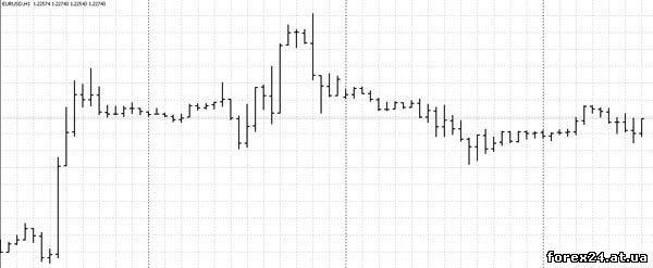
Each bar contains four parameters that are considered important to the speculator. High is the maximum price that was achieved within 15 minutes. Low will receive the minimum prices for the same period of time. The horizontal line Open, that is in contact with the vertical stripe High-Low on the left side, shows the first price of the bar. The horizontal line Close, directed from High-Low to the right, demonstrates the latest price data for 15 minutes.
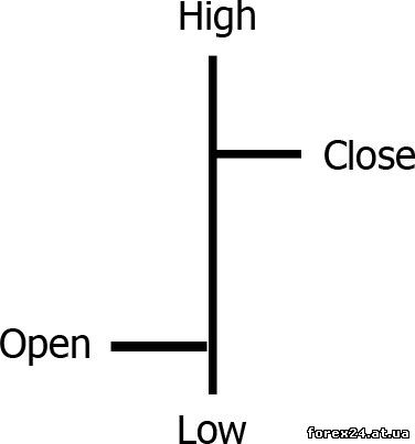
Chart - Japanese candlesticks
From the point of view of information transfer, Japanese candles are completely similar to the price bars. Also marked High and Low, we show the maximum and minimum prices chosen time interval. The body of the candle, which looks like the barrel has upper and lower boundaries, parallel to each other.
Each line shows how the price started the formation of the candle, price formation has been completed. In fact, up to this point, we can talk about a complete analogy with price bars, but one caveat. If initial and final prices fifteen minute bar looked like two horizontal lines in both sides of the vertical line, the candles do not.
To determine which of the horizontal boundaries of the barrel is the first price candle and what is the latest, just look at the color of the candle body. If the body is white, the lower boundary is the first price fifteen minutes, and the top will be the last price. If the body is black, it's the opposite.
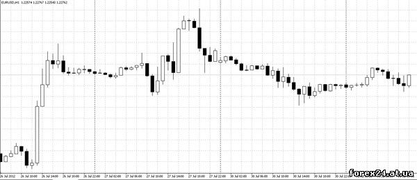
The only kind of market graphics, where color matters is the Japanese candlesticks. It is here easily visually perceived behavior of prices in the market. Quickly glancing at the terminal, it will be possible to understand where the uptrend, where the downlink, and where flat. If price bars still need to be considered, identifying the values of opening and closing time intervals, in case of use Japanese candles can be much faster to understand the market situation.
|
| Category: Forex | Added by: (05.11.2017)
|
| Views: 670
| Rating: 0.0/0 |
|
